Brief: Research, define, design, and deliver improvements to the student experience of Santa Monica College online platforms.
The challenge was to identify usability issues within the Santa Monica College Canvas platform and design an improvement that would enhance the student experience. My original concept was to create a chatbot that could guide students through assignments, deadlines, and class resources in a more intuitive way than the current interface. Over time, this scope expanded into broader usability improvements—but the chatbot remained a central experiment in showing how conversational design could make online learning more approachable and efficient.
Product Designer
3 months
Figma
Procreate
Santa Monica College Project
Students often encounter urgent issues when using the SMC Canvas platform—sometimes late at night or outside of support hours—when no one is available to help them. The challenge was to design a solution that could provide reliable, around-the-clock support and answer common student questions.
My research narrowed the scope to a Canvas-embedded chatbot for quick student guidance. But while prototyping, I uncovered deeper structural clutter in the platform itself. To address this, I rebuilt key Canvas pages with a clean hierarchy, standardized cards, and explicit navigation before docking the assistant to support students by answering questions, guiding navigation, and taking action.
I also introduced student-driven modules like Missing Assignments and Community Announcements. Usability testing validated these choices, revealing improvements in navigation clarity, progress cues, and inline feedback, which together created a much tighter and more intuitive flow.
A heuristic evaluation of the SMC Canvas website helped me narrow the project scope to the most pressing usability issues. I found that while the platform outperforms many other community college sites, the design language felt incongruous and the hierarchy of importance in the main navigation needed rethinking. These findings pointed to areas where a redesign could create a clearer, more consistent user experience.
I analyzed five educational platforms—Blackboard, Canvas, Moodle, Google Classroom, and Santa Monica College’s website to understand their strengths and weaknesses. Blackboard, Canvas, and Moodle offered robust course management tools, while Google Classroom stood out for its simplicity and integration. Moodle prioritized customization, whereas Canvas favored ease of use. Both Canvas and Google Classroom featured more modern designs and stronger integration capabilities than their peers.
From this comparison, I concluded that any improvement to the SMC Canvas platform would need to enhance usability above all else, ensuring it remained approachable and seamless for students.
Interviews with students about their experience using the SMC website revealed that, while overall impressions were positive, several recurring pain points stood out. Students found the site to be text-heavy, with unclear information hierarchy in certain areas. Accessibility challenges were also noted, alongside issues with file submission in both Corsair Connect and Canvas.
Despite these issues, students reported frequent reliance on student e-services, particularly Canvas and Corsair Connect, highlighting the importance of improving clarity and usability in these areas.

"Some parts of the website are not color blind friendly. Text on images has low contrast and is low on readability."

“Sometimes you don’t know what you are looking for. That search engine is there for a reason.”

“The design is very playful and colorful but might look better if it were modernized.”
The empathy map revealed several key takeaways: interactive features captured attention, but trust in Canvas was weakened by past technical issues, leaving students feeling academically insecure. International student enrollment information was unclear, and the site overall would benefit from abridged content and a clearer hierarchy.
This step highlighted the value of student e-services and their strong influence on our persona, especially in terms of functionality and day-to-day reliance.

The persona revealed a student who frequently relies on Canvas and Corsair Connect to manage her academic life. Her goals center on excelling in her studies to secure a good job, and she values a minimal, modern look with interactive features that feel engaging and new. Above all, she trusts SMC to help her reach her academic ambitions.
While this step felt like a continuation of the empathy map, it helped sharpen my understanding of the user base, not only what students want to achieve, but why they want to achieve it. This persona embodied lofty academic goals, pushing me to ask: how could I design a solution that truly provides value to her journey?
This step allowed me to identify a feature that would directly benefit my persona. During user interviews, I noticed both participants relied heavily on student e-services. One student shared a critical moment when a Canvas technical issue locked her out of her remote course. With no support available, her grade suffered.
The storyboard helped me visualize a high-level solution: a reliable, round-the-clock assistant that could guide students through troubleshooting steps and prevent similar setbacks. This became the ultimate goal of my design.

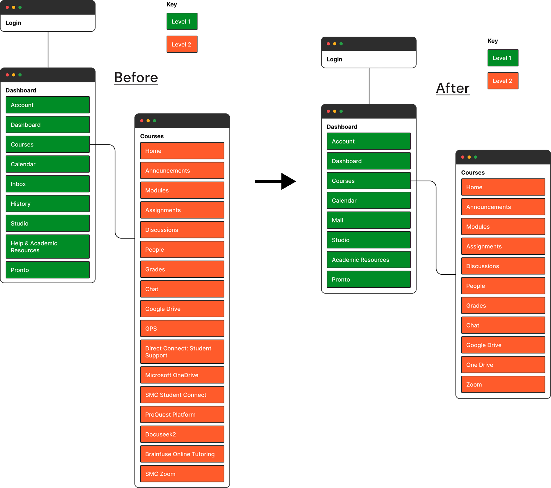
The existing Canvas sitemap contained redundant links to student help pages across the Dashboard and Course Home sections. By consolidating these into a single entry point through the chatbot, students gain a clear path for resolving questions and issues. I also removed unnecessary pages to reduce clutter, creating a more streamlined, intuitive structure that encourages students to look to the chatbot first for support.
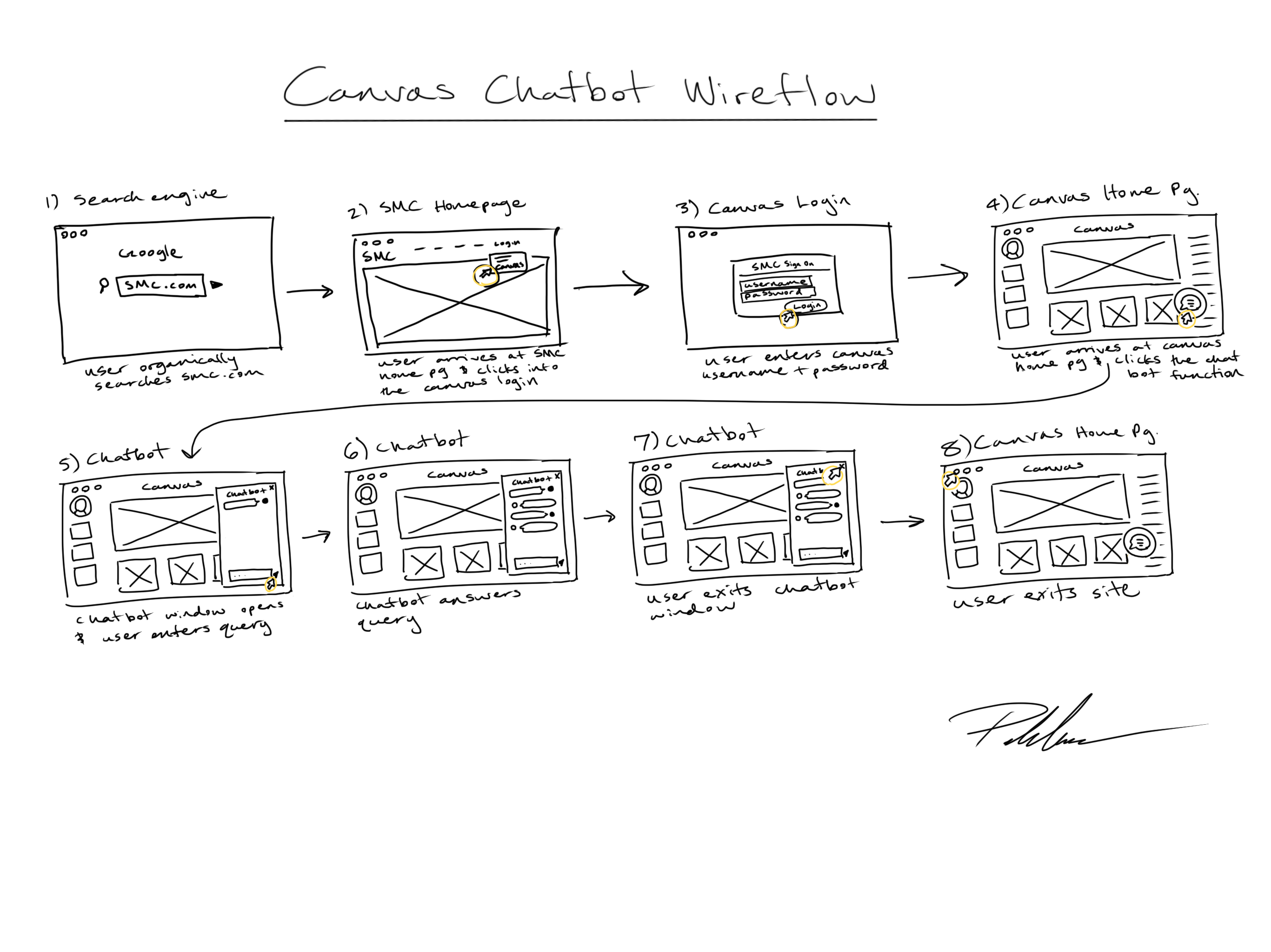
The wireflow process helped me map out exactly how a student might engage with a Canvas-embedded chatbot, step by step. This exercise clarified how many screens were needed, how the chatbot window could appear, and how interactions would unfold in real time.
One scenario captured this clearly:
By working through this flow, I could design a chatbot that felt realistic, supportive, and fully integrated into the Canvas experience.
The initial goal was simple: create a chatbot within Canvas to answer student questions. But as the wireframes developed, it became clear that the chatbot could only succeed in an environment where the platform itself was organized. This led to the beginnings of a top-down redesign of Canvas.
Through wireframing, I not only crafted scenarios where the chatbot resolved user problems, but also addressed broader pain points identified by our persona. Revisions included reducing information clutter, establishing a clear hierarchy of importance, and simplifying navigation. The wireframes became the bridge between solving a single feature need and reimagining the Canvas platform as a whole.
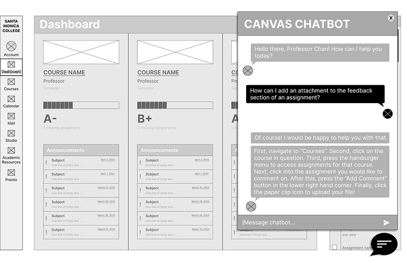
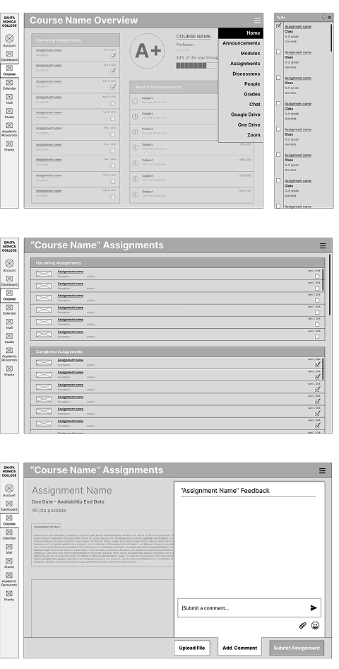
After wireframing, I pieced the redesigned Canvas pages together into a low-fidelity prototype in Figma. This step allowed me to see how the new hierarchy, navigation, and chatbot function worked as an integrated experience rather than isolated screens.
The lo-fi prototype focused on:
This clickable model gave me an early way to test assumptions, share with peers, and prepare for usability testing.
Usability testing quickly revealed the limits of my own perspective. Elements I thought were obvious often turned out to be obscure or unclear to others. At the same time, users responded positively to the overall organization and structure of my redesign, while pointing out specific objects they found confusing or unnecessary.
Without their feedback, these blind spots (and the solutions to address them) would have remained invisible. The tests underscored the value of continuous validation in transforming assumptions into a design that truly works for students.

Students were able to complete tasks smoothly and preferred the prototype’s Assignments page layout and clearer information hierarchy over the current Canvas design. However, some elements caused confusion—such as the hamburger menus, progress bar, and the process for adding comments.
Notably, students suggested features like a “Missing Assignments” section and a Community Announcements module, which would provide lasting value for both current and future SMC students.

What worked
I was pleased with how effortlessly users navigated through my flow. They progressed through my prototype intuitively, often without needing any guidance, and sometimes I even had to ask them to slow down.
What didn't work
The chatbot feature was not as immediately identifiable as I had anticipated. I need to clarify its purpose, either by adding a descriptive title or by using a more intuitive icon.

