

Almanac is a travel-readiness tool designed to help international travelers quickly understand whether a destination is safe and accessible before planning a trip. The platform surfaces visa requirements, country safety levels, and essential pre-travel information through a simple, interactive world map.
How might we make itinerary building more intuitive and immersive for travelers?
While traveling through Southeast Asia in 2024, I kept running into the same challenge: discovering where to go felt overwhelming and time-consuming. I bounced between Google Maps, blogs, review cards, and endless tabs just to decide which temples, landmarks, or neighborhoods were worth visiting. The tools were helpful, but the experience felt fragmented and exhausting.
This led me to imagine Almanac as an immersive, map-based travel experience, a 3D world where destinations expanded directly from the map and users could explore visually rather than sift through pages of text. The idea was to make early trip exploration feel more intuitive, human, and interactive.
It was an exciting concept, but ultimately still an assumption about what travelers actually needed.


Early user interviews revealed a pattern that reshaped the direction of the project.
To validate my initial concept, I conducted a round of exploratory qualitative interviews with four international travelers of differing international travel experience levels. These 20–30 minute conversations focused on how people choose destinations, what information feels hard to find, and what creates uncertainty during early trip planning.
While participants differed in experience level and travel style, the same themes surfaced repeatedly: travelers felt unsure about documentation, border requirements, and personal safety when navigating unfamiliar countries. This uncertainty often delayed or complicated their travel decisions far more than the process of discovering attractions.


Interviews highlighted a gap between my original vision and the real uncertainties travelers face around safety and documentation.
Instead of needing a more visual way to discover destinations, users were struggling with something far more foundational:
These factors shaped their decision-making long before they cared about activities, itineraries, or attractions. As a result, the product shifted from visual exploration to travel readiness; a tool focused on quickly answering the two questions that define the start of any international trip: Can I go? and Is it safe? This pivot reframed the scope of the project and guided every design decision that followed.
Almanac: A travel-readiness tool that gives users instant clarity on destination safety and entry requirements.
After identifying that travelers struggle most with uncertainty around visa eligibility and safety advisories, I designed Almanac to simplify the earliest and most consequential stage of trip planning. Instead of searching through government sites, blogs, or scattered threads, users can click any country on an interactive world map and immediately see:
Almanac replaces hours of searching with a single, reliable view that answers the questions Can I go? and Is it safe?
Travel intelligence tailored to your passport.
Almanac adapts visa eligibility and entry requirements based on the passport you hold, ensuring all information is relevant to your nationality. Users can switch passports at any time to explore how requirements change across countries.
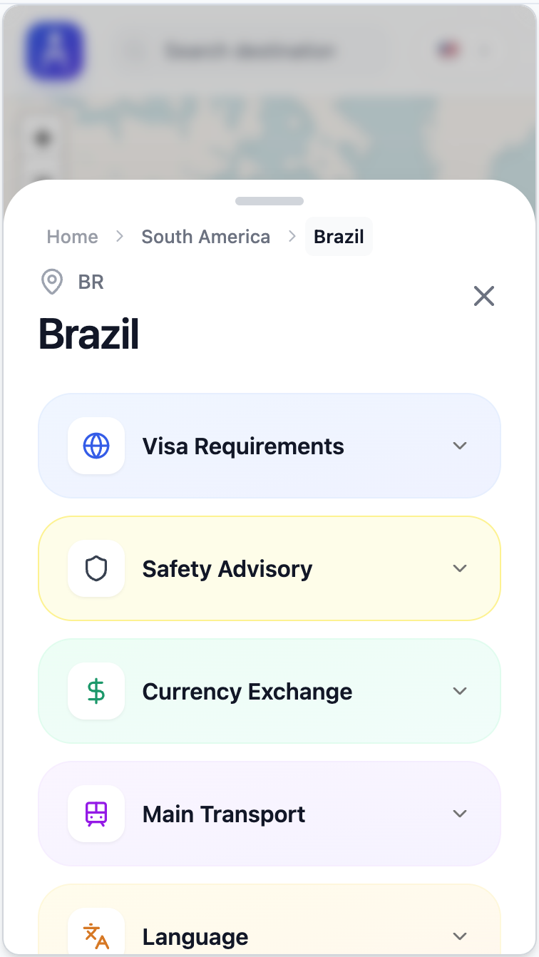
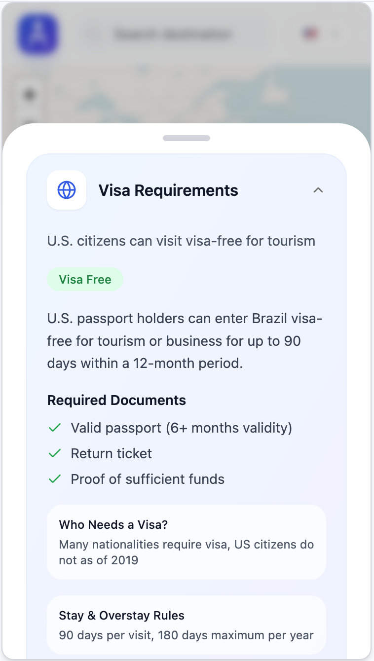
Visa, safety info, and more all in one place.
Selecting a country reveals a consolidated view of visa requirements, safety advisories, and essential country details. Accordion sections organize complex information into a single, scannable surface without forcing users to navigate multiple sources.
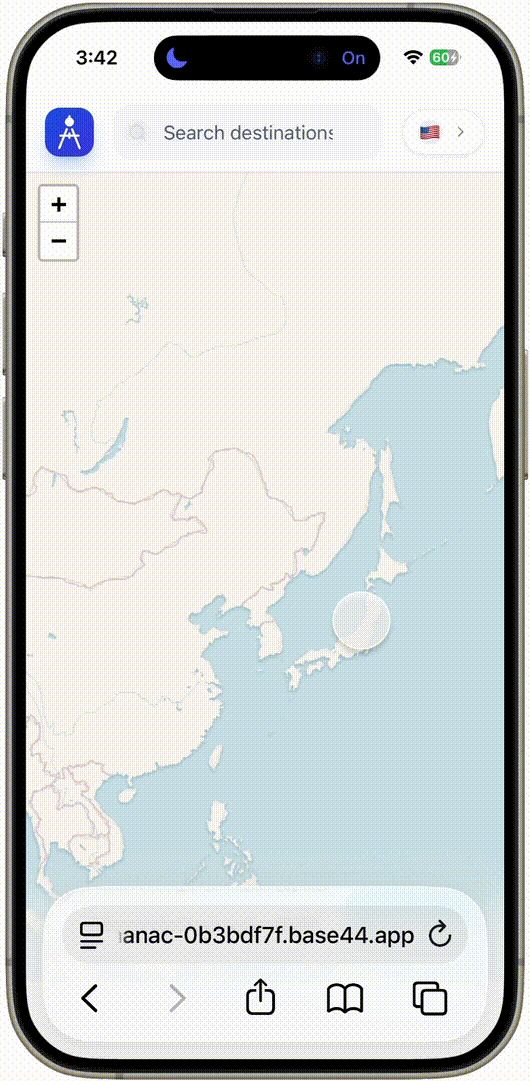
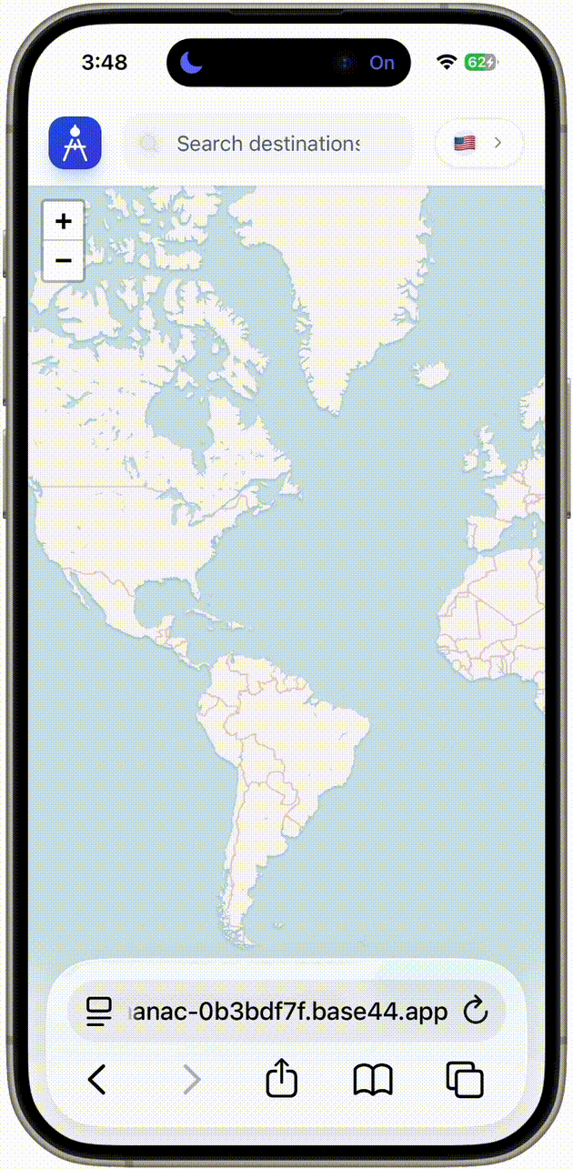
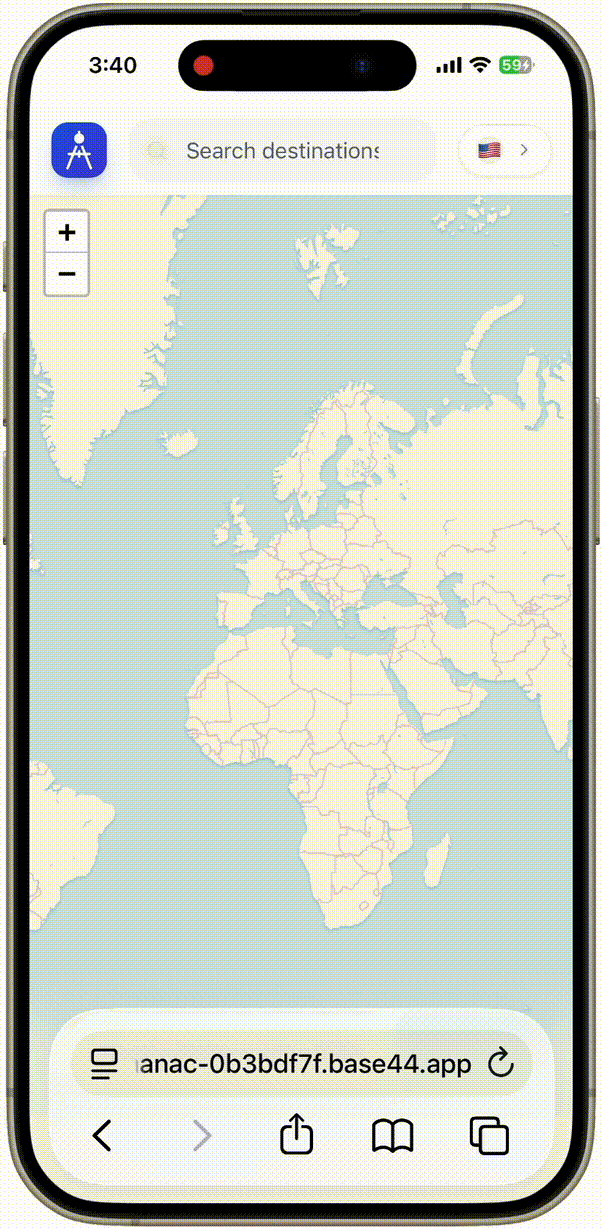
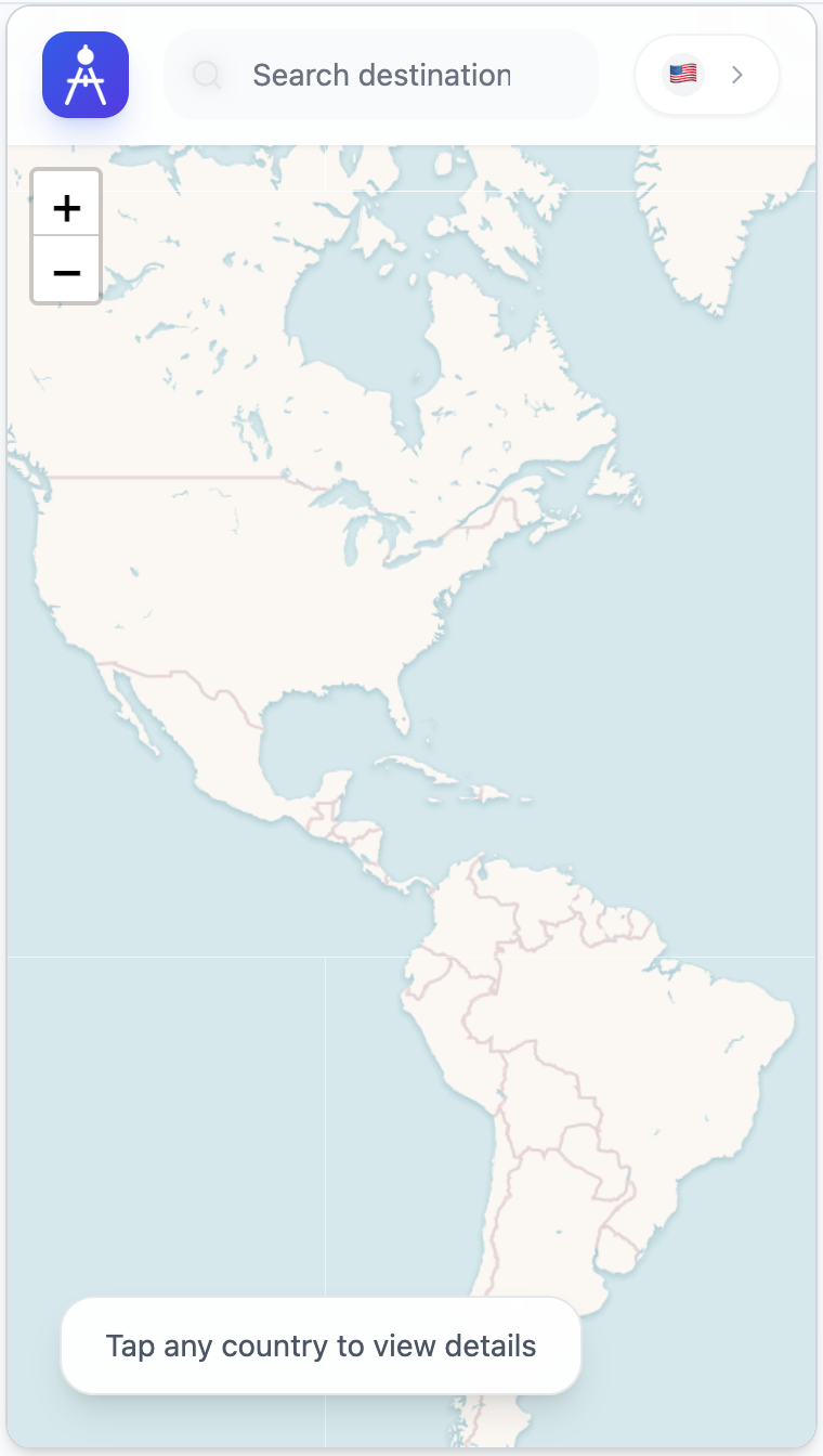
Interactive map and search.
Users can navigate freely across the map or quickly find a destination using predictive search. This dual approach supports both exploratory browsing and direct lookup, making destination evaluation fast and intuitive.
Travel intelligence tailored to your passport.
Almanac adapts visa eligibility and entry requirements based on the passport you hold, ensuring all information is relevant to your nationality. Users can switch passports at any time to explore how requirements change across countries.
Visa, safety info, and more all in one place.
Selecting a country reveals a consolidated view of visa requirements, safety advisories, and essential country details. Accordion sections organize complex information into a single, scannable surface without forcing users to navigate multiple sources.
Interactive map and search.
Users can navigate freely across the map or quickly find a destination using predictive search. This dual approach supports both exploratory browsing and direct lookup, making destination evaluation fast and intuitive.
Understanding the travelers Almanac supports.
To ground the design in real user needs, I dovetailed insights from four exploratory interviews into three lightweight personas. These personas represent the key segments most affected by uncertainty around visas, safety advisories, and essential pre-travel information. They are not replicas of specific individuals, but behavior-based archetypes that reflect recurring goals, frustrations, and decision-making patterns observed in research.
While key traveler segments like business travelers, globetrotters (experienced travelers), and expats would certainly also benefit from Almanac, I chose to focus on the personas that I felt best represented the larger and more underserved market segments.

Age
18-24
Occupation
Student
Location
Sydney
A first-time or low-experience traveler who wants to explore abroad but feels overwhelmed by unclear visa rules, safety concerns, and scattered information.
Every site tells me something different. I just want one place that explains what I actually need to travel.
Inexperienced
Low budget
Study abroad
Tech fluent
Easily distracted

Age
25-35
Occupation
Marketing Manager
Location
Los Angeles
An independent traveler who prioritizes personal safety, risk awareness, and preparedness when choosing destinations.
When I’m traveling alone, safety isn’t optional. I need to know what I’m walking into before I book anything.
Often female
Safety conscious
Cautious
Remote worker

Age
36-55
Occupation
Business Owner
Location
New York
A parent planning an international trip for their family who needs reliable information to ensure everyone’s safety and compliance with entry requirements.
When you’re traveling with kids, you can’t afford to guess. I need to know the rules and the risks upfront.
Children
Very busy
Needs reliability
High stakes
High bounce rate
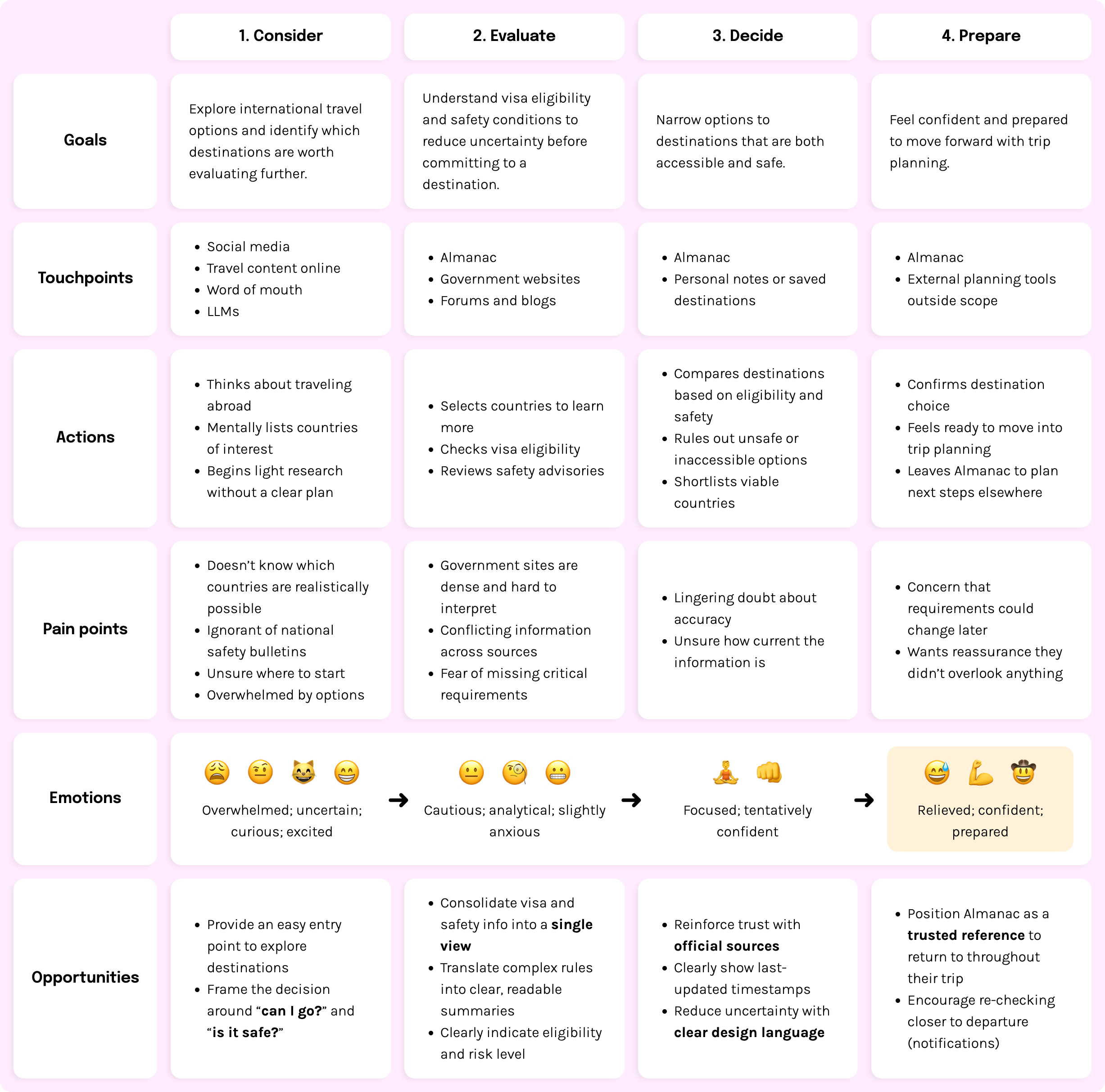
Explore international travel possibilities and identify destinations that feel both inspiring and realistically achievable.
Understand visa requirements, safety conditions, and logistical feasibility across multiple sources.
Compare viable destinations and commit to one with enough confidence that nothing has been overlooked.
Keep essential info organized and accessible before and throughout the trip to avoid surprises or disruption.
😩 🤨 😸 😁
Overwhelmed; uncertain; curious; excited
➜
😐 🧐 😬
Cautious; analytical; slightly anxious
➜
🧘♂️ 👊
Focused; tentatively confident
➜
😅 💪 🤠
Relieved; confident; prepared
Defining the core job Almanac helps travelers accomplish.
Across all personas, the earliest stage of trip planning is dominated by uncertainty. Before researching attractions or booking accommodations, travelers first need to understand whether they are eligible to enter a country and whether it is safe to visit.
"As a traveler planning an international trip, I want to quickly understand visa requirements and safety conditions for an internatinal destination so that I can decide whether it’s a viable option before planning anything else."
From dream to departure: the Student's Almanac journey

While thinking about traveling abroad during a school break, a student begins exploring potential destinations but quickly runs into uncertainty. Different countries seem appealing, but questions about visa eligibility and safety make it hard to know which options are realistically possible.

Researching online, the student discovers Almanac and uses it to evaluate destinations before committing to any plans. By selecting countries on the map, they are able to quickly review entry requirements and official safety advisories in one place, without navigating multiple government websites or unreliable forums.

With a clearer understanding of which destinations are both accessible and safe, the student confidently narrows their options and decides where it makes sense to travel. Having resolved these foundational questions early, they feel prepared to move forward with booking their trip, knowing they aren’t overlooking critical requirements.
Earning confidence through transparent, authoritative data
Almanac is designed to be trusted at moments where accuracy matters. Trust is built through:
Exploring how travelers navigate uncertainty early in planning
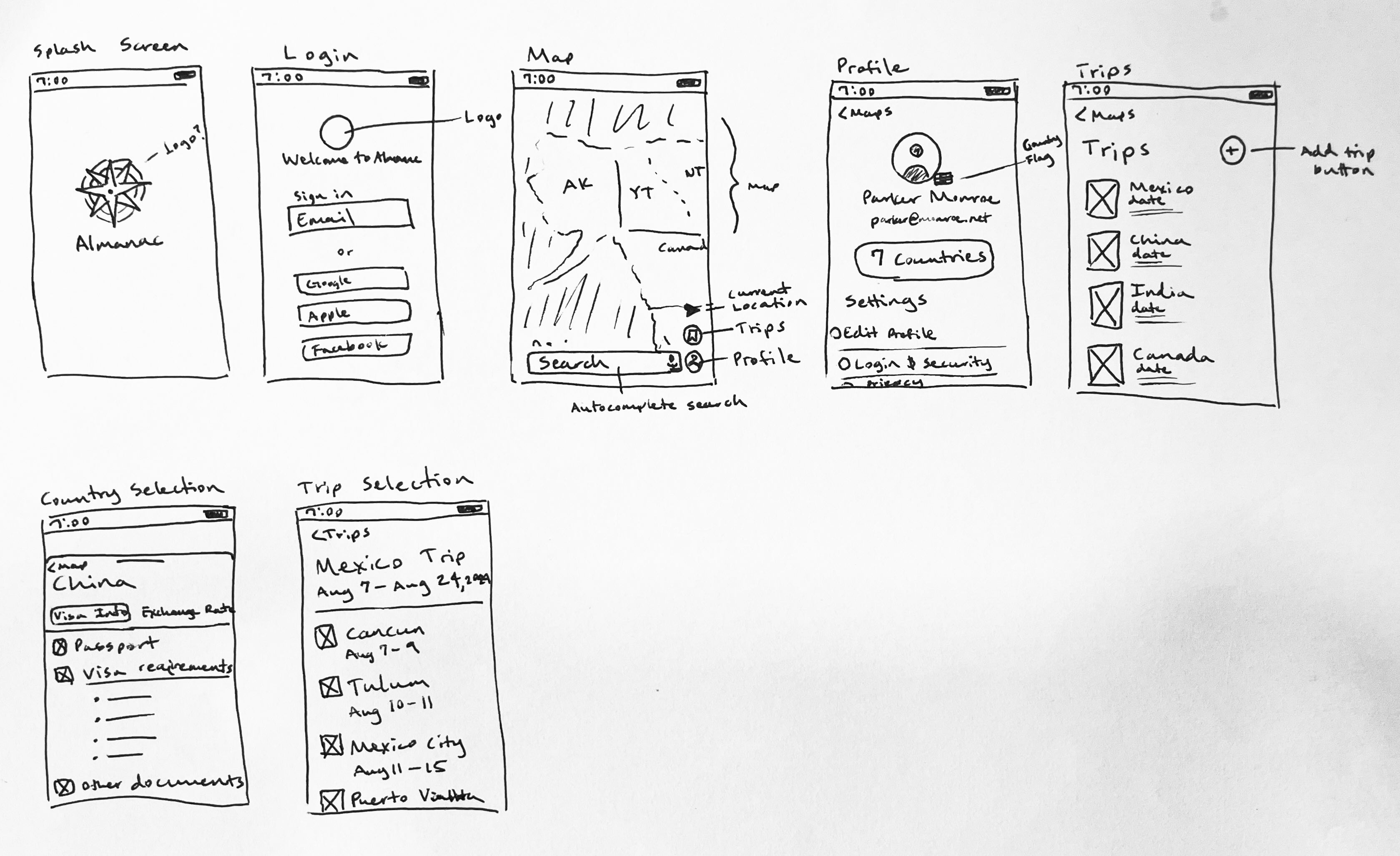
Sketching helped me quickly visualize and iterate on Almanac’s core features. Referencing familiar design patterns from established mapping applications, I identified key elements (such as the profile and map view) that shaped the app’s structure early on. These low-fidelity sketches helped me quickly test layout ideas, feature placements, and navigation patterns before moving into wireframes.
These sketches represent exploration of how travel information could be structured before the product scope narrowed to focus specifically on visa requirements and safety. Here is where the bottom drawer design pattern emerged, around which I built the rest of the product.
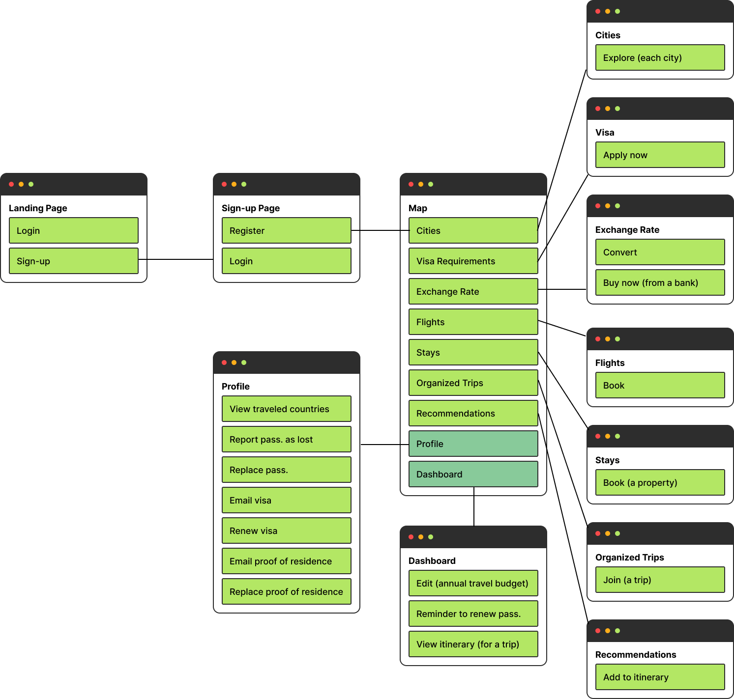
Mapping the structure of Almanac
A detailed site map helped define how users move from a global view to country-specific information with minimal friction. The information architecture prioritizes visa requirements and safety advisories as primary destinations, ensuring critical travel-readiness information is always just a few taps away. As the product evolved, non-essential planning features were intentionally trimmed to keep the experience focused on travel readiness.
Where structure meets function
Wireframes helped me define Almanac’s core structure, especially the map-first flow and the country detail drawer. At this stage, I explored a broader set of planning features, but as the product direction became clearer, the experience was simplified to prioritize visa eligibility and safety advisories.


Prototype A — Collaborative, rapid visual exploration
Prototype B — Independent, system-focused prototype
Prototype A — Collaborative, rapid visual exploration
Prototype B — Independent, system-focused prototype
Designed to guide, not overwhelm
After iterating on Figma, I translated the strongest interaction patterns into a focused, production-oriented UI aligned with Almanac’s narrowed scope. The final UI was built around accessibility, clarity, and quick access to high-priority features. From the interactive map to the passport selection, each screen supports the goal of making travel less intimidating and more intuitive.
➜
➜
Global overview designed for quick country discovery
Country specific information grouped by category
Progressive disclosure revealed through accordion sections
From concept to working product
To validate Almanac beyond static prototypes, I built a functional version of the product using Base44. This allowed me to quickly translate design decisions into a real, interactive experience and pressure-test the core value of the product in practice.
Why this build reflects the current product direction:
What’s intentionally not included (yet):
Key learnings
This project clarified how early-stage travel decisions are shaped more by uncertainty and trust than by feature depth.
Next steps