
Nancy Huang Rachel Woods Remmy Sharma
UI/UX Service design Visual design
UX Researcher

We designed an application for high school and college students that tracks their spending and subscriptions to create a path toward financial independence.
PROBLEM
Students don't feel confident regarding their finances and struggle with managing their spending wisely. Parents want their children to successfully handle finances while learning concepts like saving and tracking funds.
DEFINING PAIN POINTS
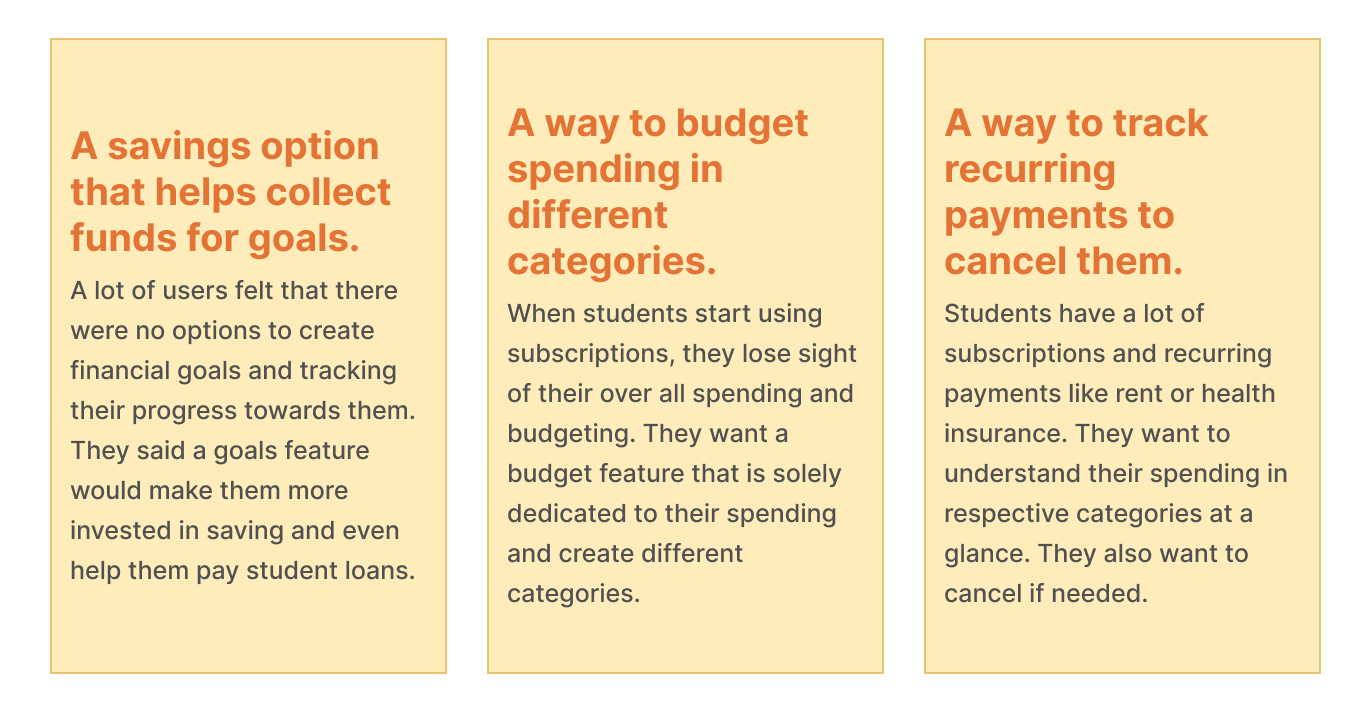
• Younger users not being able to consume expenditure data at a glance.
• Students can't keep track of their subscriptions.
• Users aren't able to set goals and save money for trips or new items.
For our solution, we created a dashboard where our users can view their recent transactions and keep track of their budgets. We designed a motivational 'goals' page that would initiate savings habits by showcasing their progress towards a monetary item of their desire. A primary feature of our solution is to cancel subscriptions with the ease of a tap.
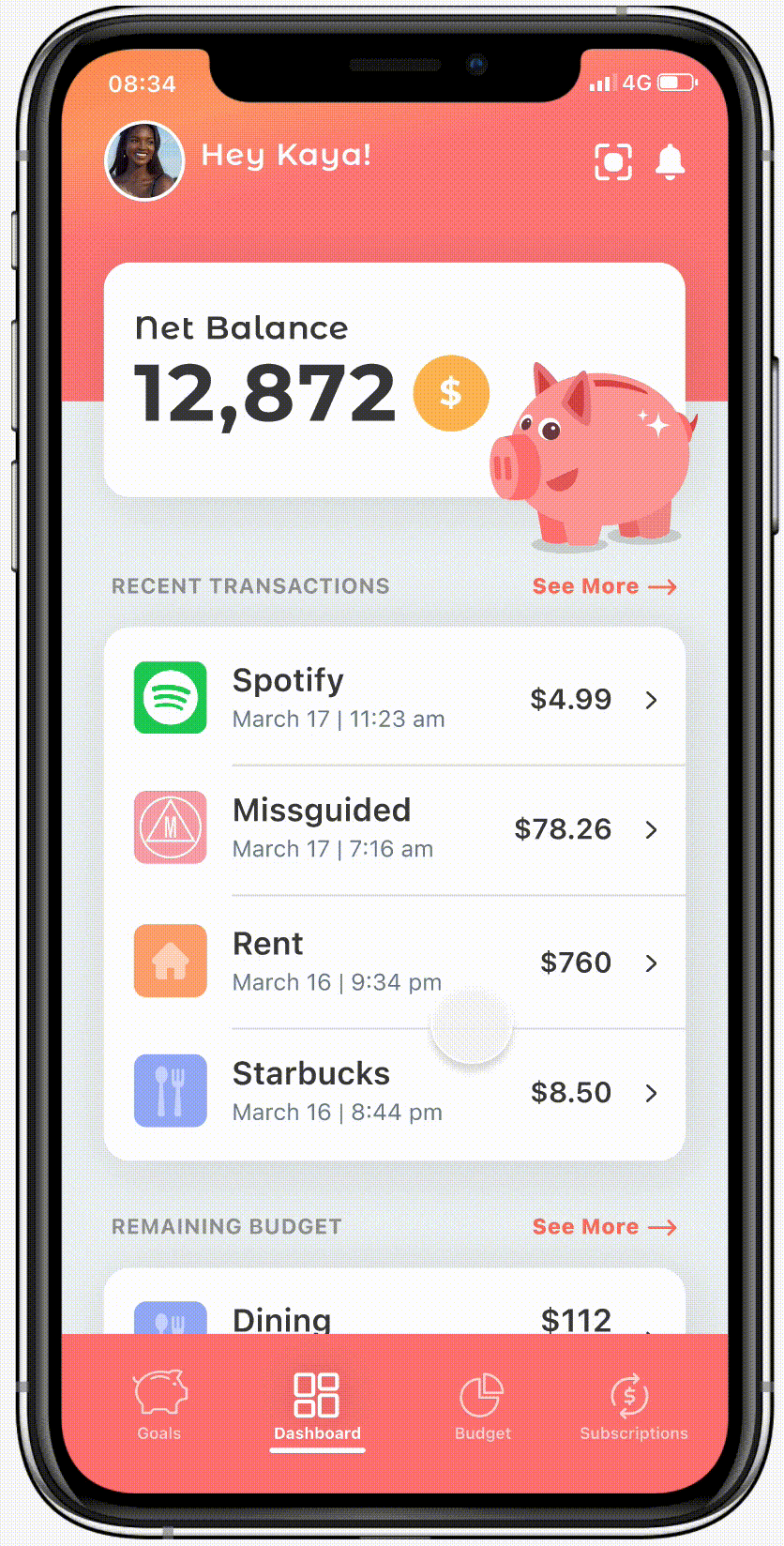
Track your recent expenses along with your budget on a simplified dashboard. A visual indicator helps students understand their remaining budget so they make smarter choices in terms of spending. The remaining budget section prioritizes the categories where a user generally spends most to least.

You are able to view remaining spending in different categories of your budget like entertainment, groceries, dining, etc. You can also view recurring payments like rent and subscriptions like Netflix to understand your spending. The spending budget is showcased in a pie chart so users can visually understand the numbers.

Create different goals and save until you collect enough funds. You can edit pre-existing goals or create new ones. A progress bar for each goal will help you visually understand how much you have saved and how close you are to fulfilling your goal.

You are able to view all your recurring payments and subscriptions in one place. Canceling a subscription is only a click away. You can view the total amount you spend on subscriptions and recurring payments to make well-informed budgeting choices.
OUR APPROACH
For our given time frame, we laid out a strategy that inform our design process. We wanted to first find competitors who were already part of the problem space we were exploring. We would then conduct user interviews to understand the pain points of students. Afterwards, we would do affinity mapping to categorize the different insights we gathered which would go on to influence our design process.

RESEARCH
At the start of the project, I came up with research questions that would guide my design process. We interviewed high school students and freshmen at different universities. Here are some questions I was interested in asking our potential users and the important insights we found.
• What would you want from a finance app?
• What features would you like on a finance app?
• What are some reasons you don't use a finance app?
AFFINITY MAPPING
Using all the important concepts we gathered from our research insights and competitive analysis, we decided to conduct affinity mapping to further categorize our ideas and create connections between features and common themes.

COMPETITIVE ANALYSIS
We were able to find companies that were part of the problem space we were exploring. A strong competitor was Greenlight which was a parent-child app designed to help children learn about finances and let parents monitor their progress. The parent can also pay their children for performing house chores. This app was directly marketed toward parents and required a premium. The other apps that were discovered were available for free but were mainly for adults to manage their finances with more complex features which disinterested the younger audience.

PERSONAS
Lorem Ipsum


LOW-FI PROTOTYPE
Our low-fidelity prototypes attempted to create a simple process with understandable information related to users' finances. We wanted to focus on topics of budgeting, savings, and subscription tracking as those themes emerged numerous times during our research phase. The following are some of the important screens of our low low-fidelity prototype which garnered the most feedback.

USER FEEDBACK
Our users felt that our approach felt like any other version of a finance app with a little flair and generated less interest. User testing indicated that users felt the processes were bland and boring but also did not understand some topics like credit scores or student loans. They wanted a 'Khan Academy' style approach to topics like budgeting, credit, and student loans and were also interested in learning about loans.

MASCOT DESIGN
To combat the disinterest in finance space from the youth, we decided to center our app narrative around a mascot. I designed the 'Savvy Pig' to create engagement with the different processes of our next prototype. It was based on a minimalist illustration approach which would complement our design style.

MID-FI PROTOTYPE
We wanted to create a more informative approach in regard to designing this prototype. We created more information about topics like credit cards, student loans, and taxes as well as an expanded budgeting option with area and custom controls.

USER FEEDBACK
After conducting user testing, we realized that a lot of our participants were not interested in credit cards and topics like student loans. They appreciated the mascot but were still apprehensive about the extensive content on for each section. They felt overwhelmed by the amount of information presented and wanted more focus on savings as well as understanding their spending. To remedy our design, we conducted closed and open card sorting research to further understand the needs of our users. Our findings indicated that most users were primarily interested in understanding their finances at a glance, monitoring subscriptions, budgeting, and saving for goals.

FINAL PROTOTYPE
After collecting feedback and organizing our insights, we were able to create the next prototype with a more clear understanding of user needs and priorities.
After presenting our prototype to users, we were able to pass a mock investment round with panelists which included designers from Venmo, SalesForce, and Lyft. The stakeholders pointed out that there should be a feature to transfer funds between users in terms of ROI. Through the critique, we found that the goals and dashboard section was appreciated and we could further work on the budgeting section.
REFLECTIONS
Through this process, I was able to form invaluable bonds with my team members and learn from their diverse skill sets. If I could go back in time, I would have conducted an open card sort during the research or wire-framing phase. I would have also liked to further research the competitors in our problem space to have a better understanding of their journey maps and how they keep users involved. This was my first User Experience project and I thoroughly enjoyed it.


